
The fact that market volatility has been elevated recently is no secret. Volatility can have a harmful effect on investor behavior. One of the most common mistakes is attempting to time the market, as investors generally react too late to be able to capitalize on gains or avoid major losses (not to mention the significant costs that come with market timing).
It’s no surprise that this behavior is more prevalent in volatile markets since it is our human nature to seek safety in times of trouble. The problem with selling in fear is that you also have to determine the appropriate time to re-enter the market. Unfortunately, most people that wait until “the coast is clear” miss out on the gains and end up buying at high prices. I don’t have to tell you that selling low and buying high is harmful.
Today I would like to present you with a few tips that you may find useful in volatile times. Follow these tips and you will never fall victim to market timing.
Stay the course. Maintaining your target asset mix of stocks, bonds, and cash is the most important part of a long-term investment plan. In fact, 90% of variation in portfolio performance can be attributed to your asset allocation. There is no one-size-fits-all allocation since everyone’s asset mix depends on individual objectives, time horizon, risk tolerance, and current financial situation. Once you (with the help of your financial advisor) determine the appropriate asset allocation for your circumstances, stick to it.
Continue automatic investment contributions. Making regular contributions to your 401(k), IRA, or taxable investment accounts is one of the best and most disciplined ways to grow your wealth. For most people, this means having a predetermined sum transferred directly from their paycheck into an investment account. Others will have automatic transfers from a checking or savings account. Regular contributions result in better average purchase prices – you buy more shares when prices are low and fewer shares when prices are high – and take emotions out of investment decisions.
Tune out the noise. These days there is an amazing amount of news outlets vying for your attention. Newspapers, magazines, and news reporters all try to identify the causes of every market gyration and predict the next move, but it’s impossible to explain market activities until long after the dust has settled. Try to ignore all this noise and keep focused on your long-term goals. As a close friend of mine so perfectly said to me, “I’m going to let you worry about all the nonsense.” Good idea.
Volatility is the norm, with market fluctuations cancelling each other out over the long term. There is never any guarantee in the financial markets, but staying on course over the long run increases the chances of meeting your financial goals.
Peter Lazaroff, Investment Analyst
Wednesday, May 19, 2010
Market Minute: Tips For Market Volatility


Monday, April 26, 2010
Preference for Value
Click here to view the full article.
David Ott
www.acrinv.com
Wednesday, March 24, 2010
Tracking Volatility with the VIX Index
The VIX tends to drift between 10 and 20 under normal circumstances, but moved above 80 following the Lehman Brothers bankruptcy in November 2008. Since then, the VIX has returned to more historically normal levels – today it sits at 17.9 compared to the historical average of 20.3 – for several reasons.
For starters, there is a lack of participation in the options markets by institutional investors who are afraid of getting trapped in the event of a quick market movement – a symptom of the scars from the credit crisis. Internal risk management systems are also limiting banks from facilitating options trades as the return of capital trumps the return on it.
And we can’t ignore the influence that vast amounts of liquidity has in driving down volatility while pumping up risky assets such as stocks or corporate bonds. Other policy responses to the crisis have reduced price swings too. For example, the Federal Reserve bought up to $1.25 trillion in mortgage-backed securities (MBS) sold by agencies Fannie Mae and Freddie Mac, basically meaning that the Fed is the market for such debt. No surprise such a big buyer would help keep volatility under wraps.
Increased volatility could spell trouble for equities, but don’t become fixated on the VIX in hopes of predicting the market’s future direction. While options activity reflects market participants’ expectations of future market conditions, their outlook and sentiment can change at a moment’s notice.
A widely publicized study released this month by Birinyi Associates showed that the VIX “is a measure of current volatility with little or no predictive or indicative value regarding the course of the market,” but the study does suggest that high volatility may be a contrarian indicator. Birinyi Associates concluded that the contrarian value of low volatility is less clear.
This Wall Street Journal article suggests that the futures contracts on the VIX may be a better gauge for predicting stock market moves. This means that investors should be bullish when the futures are significantly lower than the VIX and bearish when futures are higher. Data from Bloomberg shows that July futures on the VIX are trading at 23.25, August futures at 23.40, and September futures at 23.60 – all considerably higher than the 17.91 level today, but still not what I would consider crisis levels.
What could be pushing futures on the VIX higher?
The Fed’s MBS purchase program ends this month, which could very well allow volatility to pick up again. Other looming concerns such as rising government debt levels or a potential overheating in Chinese markets could also provide impetus for bigger price swings. VIX futures may also be pricing in a pullback in the stock market following the strong run we've had over the past five weeks.
It’s hard to imagine the VIX continues to trend lower, but the pick-up in volatility that futures are predicting is relatively minor and not worth losing sleep over.
Peter Lazaroff, Investment Analyst
Tuesday, February 23, 2010
Currency Swaps
Currency swaps have been getting some attention recently in relation to Greece entering such agreements to conceal the extent of its budget deficit.
In its simplest form, a currency swap is an over-the-counter derivative in which two parties agree to exchange streams of interest payments in different currencies. A country or corporation typically enters into a currency swap when they borrow money in foreign currency and are concerned about foreign exchange fluctuations.
For example, if a country like Greece borrows dollars in the U.S., then they have to repay that debt in dollars. If the dollar strengthens against the euro, then Greece’s debt burden would increase. As a result, Greece might prefer to repay the debt in Euros, and currency swaps are an easy way to do that.
In a plain vanilla swap, two parties exchange principal amounts at the beginning of the swap – the principal amounts are set so as to be approximately equal to one another given the exchange rate at the time the swap is initiated. Then, at intervals specified in the swap agreement, the parties will exchange interest payments on their respective principal amounts. At the end of the swap agreement, the parties re-exchange the original principal amounts – the principal payments are unaffected by exchange rates.
Greece’s swaps were not the plain vanilla kind that are designed to help manage debt, but instead were customized swaps designed to generate cash. In this instance, one party agrees to exchange money up front in return for higher payouts in the future. This sounds an awful lot like a loan, right? Yet these currency swaps are not accounted for as loans on the books of the national government.
It’s pretty easy to understand investors’ fears considering Greece has been hiding huge long-term liabilities from creditors. It’s even scarier to think about all the other countries that may have potentially entered into similar contracts.
Peter J. Lazaroff, Investment Analyst
Wednesday, January 27, 2010
Take Quality Over Quantity When It Comes To Earnings
There is no perfect definition for earnings quality, but understanding the degree of conservatism within a firm’s income statement is crucial. The best way to accomplish this is to review the firm’s revenue recognition, inventory valuation, and depreciation method – all of which can be found in the Management Discussion & Analysis section of the firm’s 10-K.
Recognizing that most readers lack the time or motivation to make such an assessment about an income statement – that’s what you hire Acropolis for – I won’t get into the gritty details. Instead, you simply need to remember that high-quality earnings are repeatable, controllable and bankable.
Let’s start with repeatable. It’s common to see a brief boost to earnings from a one-time event such as a tax-benefit or the sale of assets, both of which investors can’t rely on to be repeated. For example, the earnings pop a healthcare company gets from selling animal care unit can only happen one time. Sales growth or cost cutting, on the other hand, has a positive effect on earnings that can be repeated. Sales growth in one quarter is normally, but not always, followed by sales growth in future quarters. And cost reductions are not typically reversed quickly, thus investors can expect earnings to benefit from the operating leverage in future quarters.
One-time earnings surges can also be attributable to items out of a firm’s control. Take currency fluctuations for example. A U.S. company with large international operations would benefit from a falling dollar against international currencies since international profits are converted back into dollars. Unfortunately, management has no control over exchange rate fluctuations – this blends in with the previous point in that uncontrollable items cannot be assumed to be repeatable. Other examples of items out of a firm’s control include inflation or deflation – falling jet fuel prices can improve earnings at transportation companies like UPS. Even weather can boost earnings – utilities and coal companies enjoy extra profits when temperatures are unusually hot or cold.
The most important characteristic of quality earnings is that they are bankable. By this I mean that investors should seek firms with earnings figures that closely resemble the cash flow they generate. Cash flow, which firms can control and repeat, is the source of the highest-quality earnings. A company that recognizes revenue before cash is received (using account receivables) faces large uncertainties since customers may cancel or refuse to pay. In this case it is easy to identify the lower earnings quality because the amount of actual cash flow the company generates will be lower than the earnings number (since all of the revenue has not been collected).
The point to take away from all of this is that the earnings number itself isn’t always the best indicator of a successful company. When it comes to earnings, investors should seek out quality over quantity.
--
Peter J. Lazaroff, Investment Analyst
Wednesday, December 30, 2009
PEG ratio
The P/E ratio (or price-to-earnings ratio) is one of the most well-known valuation tools, but some people neglect to consider the impact of future earnings growth on this ratio.
The price/earnings-to-growth ratio (or PEG ratio), provides a forward-looking perspective and allows investors to compare the relative attractiveness of a stock in the context of the firm’s earnings growth outlook. Similarly to the P/E ratio, a lower PEG ratio means that the stock is more undervalued.
Calculating the PEG ratio is quite simple – divide the P/E ratio by the three- or five-year earnings compound annual growth rate. To better understand how to use the PEG ratio, consider these two technology firms.
- Hewlett-Packard (HPQ) has a P/E ratio of 13.82 and a growth rate of 11.8%
- Apple (AAPL) has a P/E ratio of 33.70 and a growth rate of 18.8%
Hewlett-Packard is clearly the cheaper company based on P/E ratio alone, but an investor might argue that Apple’s high P/E is justified by its superior growth. Apple has gained a reputation for introducing cutting-edge products and, accordingly, Apple is projected to grow earnings at an annual rate of 18.8%. Hewlett-Packard, on the other hand, is projected to grow earnings at 11.8% rate.
But after calculating both firm’s PEG ratios (Hewlett-Packard is 1.17 and Apple is 1.79) we discover that that Apple’s growth rate, although higher than Hewlett-Packard, does not justify its higher P/E. In other words, Hewlett-Packard’s stock is a better value (even if Apple makes better computers).
As you can see, the PEG ratio is useful for determining whether a firm’s high growth potential justifies their valuation.
--
Peter J. Lazaroff, Investment Analyst
Monday, December 28, 2009
Stock performance following a bad decade
Those that harp on past performance may find it difficult to invest in equities following a decade that was plagued by two brutal bear markets. But shunning equities may be a mistake.
Consider the table below.
 Each time the average ten-year return of the S&P 500 was below 6%, the following ten-year period has been very good to investors, with an average return of 13.14%. The following 20-year period is even more impressive, averaging 14.82% per year.
There are no guarantees this trend will continue going forward. After all, it’s impossible to consistently predict the direction of the market (see my June 30, 2009 post: Are you chasing performance?).
Still, the table above should at least make you rethink shunning equities for emotional reasons.
--
Peter J. Lazaroff, Investment Analyst
Tuesday, November 24, 2009
All Hail Dividend Stocks!
Dividend stocks are all the rage in the Dow Jones newsroom, with Barron’s cover story (10 for the Money) and the Wall Street Journal (Shop for Dividends in This Aging Bull Market) both championing “safe” dividend paying stocks.
This should be no surprise. The Fed’s zero-interest-rate-policy (ZIRP) is forcing investors and savers out of money-market funds and CD as the yields of those cash equivalents are virtually zero. Meanwhile, longer-term bonds sport higher yields, but leave investors exposed to inflation.
The common thesis among news articles like the ones above is quite simple. Low-quality stocks have been driving the current rally, but high-quality stocks will drive the second phase of the rally. And if the rally fades, they offer downside protection through their income.
But before you start scouring the market for yield, remember that higher yield often involves higher risk.
Here are some of the tools Acropolis uses to evaluate a company’s dividend.
Dividend Yield (Dividends per Share/Share Price)
Low yield compared to industry peers is either:
- A result of a high stock price that reflects the company’s impressive prospects and ability to make the dividend payment, or
- The company cannot afford to pay a reasonable dividend because its business model is not a strong as its industry peers.
At the same time, however, a higher dividend yield can signal a sick company with a depressed share price.
Dividend Growth
A company that increases its dividend sends a powerful message about future prospects and performance. A history of steady or increasing dividend payments often signals financial well-being and shareholder value. Double-digit growth rates are preferred, but a growth rate that at least exceeds inflation is sufficient.
Of course, dividend growth shouldn’t come at all costs. We generally frown upon companies that rely on borrowings to finance dividend payments. Watch out for companies with a debt-to-equity ratio greater than 60% since debt levels can hamper a company’s ability to pay its dividend (see financial crisis of 2008).
Dividend Payout Ratio (Dividends/Net Income) or (Dividends per Share/EPS)
In general, a lower payout ratio signals a more secure the dividend because smaller dividends are easier to pay out. A high payout ratio often means there may not be enough cash to weather hard times or raise the dividend.
However, different industries have different payout trends. For example, retail stocks tend to have ratios less than 30% and telecom stocks tend to payout more than 70% of profits. As a result, a company’s payout ratio should be compared to that of its industry peers to determine if it is high or low.
Dividend Coverage Ratio (EPS/Dividends per Share )
Dividend coverage ratio gauges whether earnings are sufficient to cover dividend obligations. In general, a coverage ratio of 2 to 3 is considered safe.
In practice, the coverage ratio becomes a pressing indicator when coverage slips below about 1.5. If the ratio is under 1, then the company is using its retained earnings from last year to pay this year’s dividend.
If the coverage is too high, say above 5, then investors should question whether management is withholding excess earnings or not paying enough cash to shareholders.
Peter J. Lazaroff, Investment Analyst
Wednesday, November 4, 2009
P/B ratio
In honor of Warren Buffett’s latest acquisition, I wanted to explain one of his favorite valuation methods: evaluating a company’s price-to-book (P/B) ratio. Broadly speaking, the P/B ratio compares a stock’s market value to its book value to determine whether or not the company is undervalued.
Book value is a company’s assets (cash, inventory, equipment, real estate, etc) minus intangible assets (copyrights, logos, etc) and liabilities (debt, unearned revenue, etc.).
Consider a simple example in which a company has $100 million in assets on the balance sheet and $75 million in liabilities. If there are 10 million shares outstanding, each share would represent $2.50 of book value. If each share sells on the market at $5, then P/B ratio would be 2.
A company may be trading at less than its book value (or have a P/B ratio of 1) for two very different reasons. One reason could be that the market believes the asset value is overvalued or that there is something fundamentally wrong with the company. If this is true, then investors should stay away since a downward correction of that asset value by the market would result in negative returns.
The other possibility is that the company is earning a dismal (maybe even negative) return on its assets. In this case, changes in management or business conditions may prompt a turnaround in prospects and provide strong positive returns. If this turnaround never materializes, then the company could at least be broken up for its asset value and, in turn, provide shareholders with a profit.
Although the P/B ratio is traditionally used by value investors, it’s also useful for investors seeking growth at a reasonable price. Growth companies tend to have higher P/B ratios, which is fine as long as the company has a high return on equity (ROE). Large discrepancies between P/B and ROE should raise a red flag.
So how does Buffett’s recent acquisition of Burlington Northern Santa Fe (BNI) railroad look?
The purchase price of $100 a share gives BNI a P/B of 2.80 and a P/E of 20 times future earnings – not exactly what most would consider a “value.” What this means is that Buffett believes the company’s growth prospects are very attractive once the economy recovers.
Railroads do, in fact, have good operating leverage to an economic recovery since more than half of operating expenses are fixed – increases in rail volume would significantly enhance profit margins. Buffett also has a history of seeking companies with strong competitive advantages such as barriers to entry. The established network of nearly impossible to replace assets provides railroads with staggering barriers to entry.
Acropolis, too, has been buyers of railroads since March; however, we favor Norfolk Southern (NSC) due to its cheaper valuation, impressive profitability, diverse customer base, and commitment to returning value to shareholders. And since we are talking P/B ratios, NSC’s is only 1.82 compared to BNI’s 2.70.
The P/B ratio shouldn’t be the sole reason for making an investment decision. Like all valuation methods, it varies across industries and can be distorted by a company’s accounting methods in their financial statements. Still, the P/B ratio is a nice starting point for finding undervalued companies.
--
Peter J. Lazaroff, Investment Analyst
Thursday, October 22, 2009
Using the P/E ratio
In general, a high P/E suggests that investors are expecting higher earnings growth in the future compared to companies with a lower P/E. Historically, stocks with lower P/E ratios outperform those with higher P/E ratios in the long term. A study done by Michael Zhuang confirms this.
Mr. Zhaung took 50 years of stock market data (1958-2007) and for each year separated stocks into three portfolios: the top 30% P/E portfolio, the middle 40% P/E portfolio, and the bottom 30% portfolio. Mr. Zhaung’s data showed that if you invested $1 in each of the three portfolios at the beginning of 1958, then you would have the following returns 50 years later:
- Top 30% P/E portfolio = $91
- Middle 40% P/E portfolio = $322
- Bottom 30% P/E portfolio = $1,698
The results also showed that there was not a single decade, in the past 50 years, in which the bottom 30% P/E portfolio did not outperform the top 30% P/E portfolio. However, this does not mean that low P/E stocks outperform every year. In 2007, for example, the top 30% P/E portfolio outperformed the bottom 30% portfolio by more than 13%.
It’s safe to say that the P/E ratio is a very useful valuation measure for long-term stock investment, but like many other valuation measures, it shouldn’t be used without comparisons. A company’s P/E ratio is more useful when compared with other companies in the same industry, to the market, or against the company’s own historical P/E. Look at the table below:

We don’t gain much out of knowing that CSCO has a higher P/E ratio than LMT because the two companies are in completely different businesses with different growth potential.
We can see, however, that the Aerospace & Defense industry is cheaper than the broader S&P 500, which indicates there is value in this industry. Even more, we see that LMT and GD re cheap relative to its industry peers (represented by the Aerospace & Defense index). We can also tell that LMT and GD are trading below their 5-year average P/E, which also suggests they are a bargain.
Comparing the technology sector to the S&P 500 tells us that the sector has is similarly valued – not too cheap, not too expensive. When comparing CSCO’s P/E to the S&P 500, the technology sector, and its historical P/E, we can assume that CSCO is fairly valued. On the other hand, the above data shows HPQ might represent a good value at this point in time.
It’s important to remember that P/E ratios of companies in very stable, mature industries typically have lower P/E ratios than companies in relatively young, fast-growing industrials with more robust future potential. This applies very well to the above example.
--
Peter J. Lazaroff, Investment Analyst
Thursday, September 17, 2009
Comparing commodity exposure strategies
Acropolis, however, does not invest directly in commodities because they do not offer the optimal risk/return relationship when compared to other inflation hedges like Treasury Inflation Protected Securities (TIPS). The table below compares the average annual return and the standard deviation (also referred to as variance or volatility) of gold, the CRB Commodity Price Index, and TIPS.
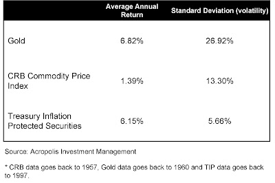 As you can see, gold has the highest average annual return but is by far the most volatile, with returns varying by 26.92%. Meanwhile, TIPS have a slightly lower average annual return but are much less volatile, with returns varying only 5.66%. The CRB Commodity Price Index, a widely used aggregate of all commodities, has the lowest return but is still more than two times as volatile as TIPS. As a result, we view TIPS as a superior inflation hedge to commodities.
Unlike other Treasury securities, TIPS’ coupon payments and underlying principal are automatically increased to compensate for inflation as measured by the consumer price index (CPI).
TIPS have a smaller track record – TIPS data only goes back to 1997 while commodities data stretches back to 1957 – so the comparison above is a bit unfair. Still, you would be hard pressed to find an investment with a guarantee by the U.S. government on the growth of your purchasing power.
In addition to TIPS, Acropolis believes owning commodity-related stocks that provide earnings and dividend streams is a more reasonable inflation hedge than owning hard assets like gold, especially with our long-term mindset.
Companies such as Chevron (Chevron), Transocean (RIG), or Arch Coal (ACI) are obviously commodity-related stocks, but you shouldn’t forget those who benefit through increased demand for mining commodities such as equipment makers Caterpillar (CAT) and Harsco (HSC) as well as industrial container manufacturers like Greif (GEF). Of course there are also transportation companies like Norfolk Southern (NSC) and Expeditors International of Washington (EXPD) that would see increased revenues in light of higher commodity prices. The list could go on and on.
Acropolis also gets commodity exposure through investments in the Asia-Pacific and Australian regions, where commodities are a key driver of economies. Even more, the commodity exposure of Emerging Markets is more than double that of the S&P 500.
--
Peter J. Lazaroff, Investment Analyst
Wednesday, July 15, 2009
Asset Allocation Worked in 2008
Last year was a terrible year for investors. Now, the peanut gallery is making the claim that asset allocation failed and diversification didn’t work. That’s bull.
Although there have been several articles from a variety of places, it is this front-page article from the Wall Street Journal that has my blood boiling.
The incendiary title started me off on the wrong foot: Fail-Safe Strategy Sends Investors Scrambling.
Any responsible investor with any appreciation for markets knows that no strategy is fail-safe. The only thing that worked all the time was Bernie Madoff (that is, until it didn’t).
The thrust of the article is that everything went down. It is true that pretty much all stock indexes went down, and diversifying amongst equity asset classes didn’t offer any benefit. However, it is outright false to say that asset allocation didn’t work.
For me, the Ibbotson SBBI Classic Yearbook is like the Rosetta Stone because SBBI was instrumental in developing my thinking about asset allocation and diversification. So, I start there with the six asset classes that Ibbotson lays out in the Basic Series:
Large Cap Stocks - 37.00%
Small Cap Stocks (really Microcap) - 36.72%
Long-Term Corporate Bonds + 8.78%
Long-Term Government Bonds +25.87%
Intermediate Term Government Bonds +13.11%
U.S. Treasury Bills (Cash) +1.60%
At the most basic level, asset allocation worked perfectly well. Stocks went down, but bonds and cash went up.
It is true that pretty much all stocks went down. It didn’t matter if you were large or small, international or domestic, growth or value. All of the subsets and derivations lost big.
As for bonds, I am not sure exactly where Ibbotson gets their Long-Term Corporate Bond data; it isn’t quite what I saw last year. For example, the Barclays US Long Credit A/Better Index lost 0.24 percent. Ibbotson says that their index is based on 20 year maturities, but the current maturity for the Long Credit Index is 24.80 years (11.7 year duration).
Other credit bond indexes were as follows:
iBoxx $ Liquid Investment Grade Index: +0.96%
Barclays U.S 1-3 Year Credit Index +0.30%
Barclays U.S. Intermediate Term Credit Index: -2.76%
Barclays U.S. Credit Index -3.08%
These aren’t exactly eye-popping returns, but they were lowly correlated with U.S. stocks. And, this was the year that credit markets were broken. Take a look at Treasury bond performance:
Barclays U.S. 20+ Year Treasury +33.72%
Barclays U.S. 10-20 Year Treasury +19.69%
Barclays U.S. 7-10 Year Treasury +17.97%
Barclays U.S. 3-7 Year Treasury +13.26%
And, you didn’t have to be solely in Treasuries either. The Barclays U.S. MBS Index gained 8.34 percent, and the Barclays U.S. Agency Index gained 9.26 percent.
Even muni indexes posted positive returns, despite the increasing trouble in many states and municipalities. The Barclays National 0-5 Year Municipal Bond index gained 5.05 percent.
This isn’t to say that all bonds went up – some went down. Preferred stocks, non-Agency mortgage backed securities, high yield (junk) bonds all lost substantially. These are derivations of the credit markets, which had a lot of trouble. They also shouldn’t be in the vast majority of portfolios. Professional investors know, for example, that junk bonds trade like stocks, not bonds.
If you didn’t want to bother with all of the various bond market sectors, just take a look at the Barclays U.S. Aggregate Index. It gained 5.25 percent last year, which is pretty consistent with what you would expect from a long-term bond allocation. In fact, the long-term rate of return for Intermediate Term Government Bonds according to Ibbotson from 1926 through 2008 is 5.24 percent.
Despite one money market mutual fund breaking the buck, all the others held up. It’s true that the government had to come in and lend a helping hand, but cash is pretty much cash. Those who had made sure that their cash didn’t contain undue credit exposure for a little extra yield didn’t have any problems.
If it wasn’t obvious, this article was meant to say that the basic building blocks of asset allocation worked exactly as one would expect. My next article on the subject will look at whether one year is the right time frame to make the statement that asset allocation doesn’t work. I’ll bet you can guess where I come down on that when I say that investing is for the long term…
--
David Ott
Tuesday, July 14, 2009
CPI and PPI biases
As I mentioned in the most recent Portfolio Insights article titled “Inflation FAQs,” there are a few problems with the Consumer Price Index (CPI) and Producer Price Index (PPI) as inflation gauges.
CPI has an upward bias that is estimated to overstate inflation by about 1 percentage point per year. This can be particularly problematic for employment contracts with cost-of-living adjustments based on CPI as well as for a substantial portion of government spending, such as entitlement payments, which automatically increase with CPI.
The most commonly cited biases that tend to overstate the CPI include:
- New goods. New products that replace existing products are often more expensive at first. This biases the index because some of the newly-available goods perform the same function as different lower-priced goods in the base-year market basket.
- Quality changes. If the price of a product increases because the product has improved, the price increase is not due to inflation, but still causes an increase in the price index.
- Substitution effect. Inflation or not, prices of goods relative to each other are always changing. When two goods are substitutes for each other, consumers increase their purchase of the relatively cheaper good and buy less of the relatively more expensive good. Over time, such changes can make the CPI’s fixed basket of goods a less accurate measure of typical household spending. The chained CPI, however, does adjust to the substitution effect in a timely manner as the basket of goods is “chained.”
- Outlet substitution. When consumers shift their purchases toward discount outlets like Wal-Mart and away from convenience outlets like the neighborhood grocer, they reduce their cost of living in a way the CPI does not capture.
The biases to Producer Price Indexes (PPI) are not quite as extreme and not as important because firms can absorb costs and they don’t get passed on to the consumer. But for educational purposes, here are some of the minor shortfalls of PPI:
- Industry weightings. PPI uses relative weightings for different industries, but these weightings might not accurately represent their actual proportion to real gross domestic product (GDP). As a result, the weightings are adjusted every several years, but small differences still occur.
- Hedonic adjustments. PPI calculations involve an explicit “quality adjustment method,” called hedonic adjustments, to account for changes that occur in the quality and usefulness of products over time. These adjustments may not effectively separate out quality adjustments from price level changes as intended.
- Volatile elements. Energy and food often skew the data because they are so volatile. As a result, the removal of food and energy prices is almost implicit in most media releases. However, the long-term growth rates should not be ignored if these costs grow faster than the core PPI (or CPI) over time because consumers and eventually GDP will feel the pinch.
--
Peter J. Lazaroff
Tuesday, June 30, 2009
Are you chasing performance?
One of the most common examples of performance chasing is when investors use performance over the last one, three, or five years as the sole criteria for selecting investments in their retirement accounts. Historically, a period of above-market performance for a given fund will be followed by a period of below-market performance.
This is because it is virtually impossible to consistently predict the next direction of the market as a whole. Timing the purchase or sale of investments in an attempt to “beat the market” is highly unlikely to increase long-term investment performance.
Notice the first graphic below (you may want to click to enlarge). If an investor looked at this table in the year 2000, he/she might have concluded that Information Technology was a sure-fire way to make money. Unfortunately for those performance chasers following this logic, the Information Technology sector was one of the worst performing sectors for the next three years.

Of course, the same holds true for asset classes as you can see in the graphic below (click to enlarge).

--
Peter J. Lazaroff
Tuesday, June 23, 2009
Margin Analysis
In 2008, railroad company Norfolk Southern (NSC) had an annual net income of $1.7 billion on sales of about $10.6 billion. Its major competitor, Burlington Northern Santa Fe (BNI) earned about $2.1 billion for the year on sales of about $18 billion.
Comparing the Burlington’s net earnings of $2.1 billion and Norfolk’s $1.7 billion shows that Burlington earned more than Norfolk, but it doesn’t tell you very much about profitability.
If you look at the net profit margin, or the earnings generated from each dollar of sales, you’ll see that Norfolk produced 16 cents on each dollar of sales, while Burlington returned less than 12 cents. This is one of the many reasons that we value Norfolk more than Burlington.
There are three types of profit margins:
(1) Gross margin indicates how efficiently management uses labor and supplies in the production process.
Gross Margin = (Sales – Cost of Goods Sold) / Sales
Companies with high gross margins will have a lot of money left over to spend on other business operations, such as research and development or marketing. Downward trends in the gross margin rate over time are a telltale sign of future problems facing the bottom line. It’s important to remember that gross profit margins can vary drastically from business to business and from industry to industry. A perfect example of varying ratios across different industries is the airline industry and software industry with gross margins of about 5% and 90%, respectively.
(2) Operating margin compares earnings before interest and taxes (EBIT) to sales, which shows how successful a company’s management has been in generating income from the operation of the business.
Operating Margin = EBIT / Sales
High operating profits can mean the company has effective control of costs, or that sales are increasing faster than operating costs. Some consider operating profit a more reliable measure of profitability than net profit margins since it is harder to manipulate with accounting tricks than net income. Operating margin will be always be less than gross margin because it accounts not only for the costs of goods sold (COGS), but also selling, general, and administrative (SG&A) costs.
(3) Net profit margin measures the profits generated from all phases of a business, including taxes. It comes as close as possible to summing-up in a single figure how effectively managers run the business.
Net Profit Margin = Net Profits after Taxes / Sales
Companies with high net profit margins usually have one or more advantages over its competition, a bigger cushion to protect themselves during downturns, and the ability to improve market share during downturns which leaves them even better positioned when things improve again.
--
Peter J. Lazaroff
Wednesday, June 17, 2009
Free Cash Flow (Part II)
There are two ways to calculate free cash flow. The first uses the company’s cash flow statement and balance sheet.
Free Cash Flow = Cash Flow From Operations – Capital Expenditures
The second uses the income statement and balance sheet.
Net income
+ Depreciation/Amortization
-Change in Working Capital
-Capital Expenditure
-------------------------------
= Free Cash Flow
Without a regulatory standard for determining free cash flow, investors often disagree on exactly which items should classified as capital expenditures. As a result, it is important to “check under the hood” of companies with high levels of free cash flow and see if they under report capital expenditures and R&D.
Companies can also temporarily boost free cash flow by stretching out their payments, tightening payment collection policies, and depleting inventories. These activities diminish current liabilities and changes to working capital.
A more complicated accounting is the hiding of receivables. This occurs when a company records a revenue in which cash will not be received within a year, but places the receivable in another line item outside of “non-current” assets. Accordingly, revenue is recorded and cash from operations increases, but no current account receivable is recorded to offset revenues. Thus, cash from operations and free cash flow enjoy a big but unjustified boost.
Like all performance metrics, free cash flow has its limitations. Still, it is a great place to start searching for quality investments.
--
Peter J. Lazaroff
Tuesday, June 16, 2009
Free Cash Flow
Many investors tend to use a company’s earnings to evaluate performance, but net income can easily be distorted by accounting gimmicks. Free cash flow, on the other hand, is difficult to fake (though not impossible) and provides a more transparent view of a company’s ability to generate cash and profits.
Free cash flow is the cash left over after a company meets its necessary expenses. A company can reinvest their free cash to grow its own business and, in turn, boost shareholder returns. Alternatively, free cash flow can be returned to shareholders through bigger dividend payments or share buybacks.
There are many ways to use free cash flow in a company analysis. I will use beverage giant Coca-Cola (KO), which is a great example of a company that consistently generates high free cash flows, which often exceed its reported net income – a sign of high earnings quality.
Free cash flow to Revenue
In 2008, Coca-Cola produced $5.6 billion in free cash flow from $31.9 billion revenues. Thus, Coca-Cola’s free cash flow to revenue ratio was an impressive 16.6 percent – a good rule of thumb is to look for companies with free cash flow that is more than 10 percent of sales revenue.
Free cash flow multiples
It is also important to look at free cash flow multiples. Free cash flow yield allows you to compare how much cash power the share price buys, or how much investors pay for one dollar of free cash flow. Price to free cash flow is similar to the more commonly known price/earnings (P/E) ratio.
Comparing Coca-Cola to direct competitor Pepsi Co. using these multiples suggests that Coca-Cola is reasonably priced.
Efficiency Ratios
Besides looking for low free cash flow multiples, we also seek out attractive efficiency ratios. An attractive Return on Equity (ROE) can help ensure that the company is reinvesting its cash at a high rate of return.
On this front, Coca-Cola performed exceedingly well with a ROE of nearly 26%. In other words, Coca-Cola was able to generate 26 cents worth of profits from each dollar invested by shareholders.
To double check that the company is not using debt leverage to give ROE an artificial boost, we also examine Return on Assets (ROA).
A ROA higher than 5% is normally considered to be solid for most companies. Coca-Cola has an impressive 12.6 % ROA, which should reassure investors that the company is doing a good job of reinvesting its free cash flow.
--
Peter J. Lazaroff